Space Elevators: Going Up?

When it comes to getting into space, rockets are pretty much staircases at best. More like ladders, really.

McCoy Fields: Going Up!

Space Elevator

That’s a bizarre thing to say, I know, but hear me out. Rockets are expensive and dangerous, but they’re still the best way we have of getting to space. (There are a couple of other ways, like Orion drives, but given that those things basically ride nuclear explosions…) There’s a theoretical method, that works much, much better: the space elevator. (Hence the staircase joke. Well, I thought it was funny, at least. So I’m not a professional comedian, so sue me.)

A space elevator is, essentially, a long cable—anchored at the equator, extending out into orbit. It works sort of like when you spin while holding a rope, and the rope is suspended above the ground by centrifugal force. (Or is it centripetal? I can never remember.) It’s not quite the same, of course, since it has to have a counterweight at the end, along with several other requirements.

Once the cable is up, cargo and passenger pods would be able to freely move up and down it, at much, much lower costs than rockets. Did I mention how expensive rockets are? Really, really expensive. As in: $10,000 to $25,000 per kilogram they need to lift. (For those of you who don’t have your measurement conversion tables memorized, one kilogram is equal to a bit more than two pounds.)
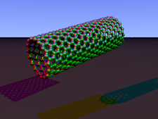
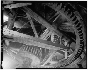
Carbon Tube

Carbon Tube

So why aren’t we using them now? Well, because we don’t have a strong enough cable. People keep bringing up carbon nanotubes as an option, but since we don’t have those yet, we just can’t build it.

The space elevator would be more than possible on other, smaller objects in the Solar System. We could build a space elevator on the moon with ordinary Kevlar.

Space elevators aren’t the only ideas for getting to space without rockets. Other ideas are floating out there, ranging from rocket sleds (which does actually involve rockets, but in a much more affordable manner) to skyhooks, which resemble something that a mad scientist, a six year old, and an engineer would design together if asked to create the nuttiest amusement park ride ever, all while hooked to caffeine IV drips.

Honoring the Hurriquake Nail

The HurriQuake

The HurriQuake

Disaster-proofing homes is not something you want to skimp on, especially if you’re living somewhere with tornadoes, earthquakes, hurricanes, or door-to-door encyclopedia salesmen at six in the morning. Generally speaking, building codes require a certain level of disaster-proofing in new buildings, depending on the area. It’s always better to be safe than sorry.

Disaster proofing can, of course, get pretty frivolous. There really isn’t a particularly compelling reason to install blast-proof wallpaper in your average suburban home in America (anyone who lived through part of the Cold War remembers bomb shelter advertisements).

One technical advancement that I do find pretty worthwhile, however, is the HurriQuake nail. (Engineers should never get to name things.) This is a bizarre-looking cross between a nail and a screw, and it’s specifically designed to withstand extreme amounts of stress, from causes ranging from high wind to earthquakes. It actually won Best Innovation of the Year from Popular Science in 2006.

The nail is actually so strong that the boards the HurriQuake nail is hammered/screwed into usually fail before the nail does. And it’s cheap enough that it only drives up the cost of houses by a few dollars.

That’s not to say the HurriQuake nail is perfect. If you put one in the wrong spot, good luck getting it out. The same spikes that keep it lodged in boards—even under extreme force—are largely capable of resisting much more force than you can apply.

isabelOf course, fancy nails alone aren’t enough to disaster-proof a house. You’ve got to design the whole building, foundation to roof, with that goal in mind. It’ll cost more and take more work, too, but this is a key part of designing a house to fit the environment it’s in. Which is one reason you see so many antique houses outlasting suburban cookie-cutter houses.

Civilization and Roads

Good roads are absolutely essential to civilization. Many of the most successful countries in history were hugely dependent on their roads for their success. To my mind, the two ancient civilizations with the most impressive road systems are the Roman and Incan Empires.

The Incan road system, the shorter of the two, was still more than 20,000 miles long. The Incans did such a good job that much of the road is still useable today—even segments that haven’t seen a lick of maintenance in four centuries—though more than 75 percent of it has been destroyed by Spaniards and modern construction. The Incan roads were heavily used by the Chasquis, a network of runners that sent messages and valuable, lightweight goods across the empire, using relays. The individual Chasqui ran as much as a hundred and fifty miles per day through the mountains—that’s six marathons. The roads were also used heavily by normal traffic: trade on alpacas and llamas, etc.

McCoy Fields

Ancient Roman Rest Stop?

Rome’s roads are, without a doubt, the best known of all ancient road systems—not surprising, since it’s the best known ancient civilization of all time. There were 250,000 miles of roads in the network, an order of magnitude larger than the Incan network.

It’s not to say that the Incan network wasn’t an incredible piece of engineering and architecture; it was, but the Romans were just utterly obsessed with road building. There is an astonishing number of these roads still in use, whether covered in modern construction or even in their original form.

Yes, roads are an absolutely elemental part of civilization. I should put this all into perspective, though. America has nearly four MILLION miles of roads. Our population dwarfs Ancient Rome or the Incan Empire and, of course, the American population alone is greater than that of the entire world during either of those time periods.

So, next time you’re upset about construction, just sit back and think about that before complaining. It’s a small price to pay. (Unless it’s in front of your house early in the morning. That’s just the worst.)

Tilting at Windmill Research

As I was fishing with the grandkids recently, the eldest asked me why windmills look the way they do these days, instead of the way they looked in the old days and in cartoons.

Pantigo Windmill, East Hampton

Pantigo Windmill, East Hampton

I didn’t know, so when we got home later that day I helped him look it up. I’d rather admit I don’t know something to a kid and then help him research than just make something up or just brush off the question. Plus, it helps teach kids how to learn things themselves.

The answers regarding the windmills turned out to be pretty interesting, even if a lot of the math was still beyond him.

First off, the arms on a windmill are long and thin these days in order to function like a wing, which drastically increases their efficiency. So far, pretty straightforward stuff.

Next, and the most complicated: why they have three arms. Turns out there’s a whole load of math involved. A single arm would be most efficient, but wouldn’t produce much power. Two arms at 180 degrees actually puts considerable strain on the hub of the windmill, which reduces the energy it produces and causes long-term strain and damage.

Three blades solves all of these problems; using more than three starts to reduce efficiency. That’s not the only reason, of course. It also costs quite a bit more to build windmills with a larger number of blades.

The reason most windmill blades are a certain length is actually due to the shipping industry. Most of the blades are at the maximum length that can be carried by a semi on the highway. While there are some longer blades that can be transported by train and then by helicopter, they’re expensive and difficult to produce and move.

As for why windmills are painted white? My grandson actually figured that one out before we looked it up, which made me proud: The white paint reduces the heating on the windmill parts.

Plus, it just looks nice.

Maps and Oranges

When I have a choice of what map I want to use, I’ll always pick a globe.

Flat maps all have one major problem: they’re trying to display a round globe.

Here’s an experiment. Cut an unpeeled orange in half, then take out the insides without ripping the peel. Then try to push the peel flat on a surface.

Mercator Projection: 1569

Mercator Projection: 1569

Mapmakers have developed a number of strategies for dealing with the problem. They’re referred to as map projections, and the most commonly used is the Mercator Projection. It’s by far one of the most common map projections you’ll run into.

The Mercator Projection is quite useful and works great for navigation…but at the cost of grossly misrepresenting the size of certain landmasses, especially closer to the poles. The best way to picture this is by stretching out that orange peel. There’s going to be quite a bit of distortion.

Greenland is the biggest offender. Greenland in real life is 1/14th the size of Africa, and 1/3rd the size of Australia, but it is grossly inflated on the Mercator Projection and is actually portrayed as larger than Australia. Africa, meanwhile, is shrunk down until it appears the same size as Greenland on the map. This has actually produced quite a bit of academic and political controversy over the years. The Mercator is drifting out of popularity these days.

Another common map projection is the Goode homolosine projection. This one is the equivalent of cutting the orange peel to make it look flat; in fact, it’s often called the orange peel map. While the Goode homolosine projection does a much better job of representing the continents without distorting them, it does cut Greenland in half and, well… you can see what it looks like.

Given the choice, I’m always going to use a globe. Unfortunately, they’re less than perfectly portable.