When I have a choice of what map I want to use, I’ll always pick a globe.
Flat maps all have one major problem: they’re trying to display a round globe.
Here’s an experiment. Cut an unpeeled orange in half, then take out the insides without ripping the peel. Then try to push the peel flat on a surface.
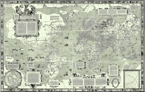
Mercator Projection: 1569
Mapmakers have developed a number of strategies for dealing with the problem. They’re referred to as map projections, and the most commonly used is the Mercator Projection. It’s by far one of the most common map projections you’ll run into.
The Mercator Projection is quite useful and works great for navigation…but at the cost of grossly misrepresenting the size of certain landmasses, especially closer to the poles. The best way to picture this is by stretching out that orange peel. There’s going to be quite a bit of distortion.
Greenland is the biggest offender. Greenland in real life is 1/14th the size of Africa, and 1/3rd the size of Australia, but it is grossly inflated on the Mercator Projection and is actually portrayed as larger than Australia. Africa, meanwhile, is shrunk down until it appears the same size as Greenland on the map. This has actually produced quite a bit of academic and political controversy over the years. The Mercator is drifting out of popularity these days.
Another common map projection is the Goode homolosine projection. This one is the equivalent of cutting the orange peel to make it look flat; in fact, it’s often called the orange peel map. While the Goode homolosine projection does a much better job of representing the continents without distorting them, it does cut Greenland in half and, well… you can see what it looks like.
Given the choice, I’m always going to use a globe. Unfortunately, they’re less than perfectly portable.